Title/Font Choices and Connotations
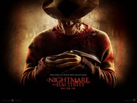
A good point about this font is the colouring. using a red colour is very common in the horror genre as it relates to the colour of blood which makes it seem scary.
Another good point is that the font style is bold, simple and easy to read along with being a good size as its not too large to cover the image yet its not too small to read.
They've made the font size larger on the word NIGHTMARE and smaller on the rest as the word nightmare is the scariest of the title. this is a good effect as it exaggerates the title to enhance the fear.
Would we use this style in our title?
- No because this font style only works for titles with more than one word within the title. (ATL)
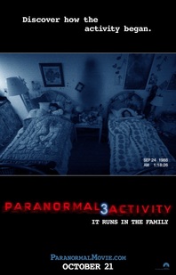
One good point on the font style of paranormal activity is that it reflects the words "paranormal activity" showing it to be a shadowing affect.
Another good point of this title is that it it does have a horror styled colour although doesn't resemble the film in anyway by using this.
The white connotation at the top gives a good interesting comment which will set an idea that will stick in the audiences heads for a while.
We could use this idea in our plan as we could have this short sentence as more of a spine chilling quote that will scare the audience but attract them at the same time. (CTS)
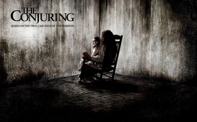
This is a brilliant title from the conjuring. it shows a clear font which is sharp and piercing so that it stands out from the smudged white gloomy background.
This colour is more suitable for the ghostly genre of horror as it is black and white which gives the impression of paranormal colouring.
They've not stereotypically chose the colour red, which i believe is a good idea as it is different from other horrors making it more memorable
Would we use this idea for our final title design?
-Yes, this would be a very suitable style for our film named "The Hidden" which would work well. our film also has no blood and has a strong black and white contrast meaning that our idea will be inspired by the conjuring (CTS)
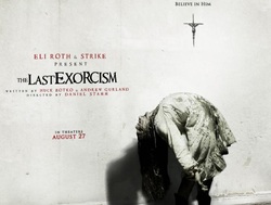
The title from 'The Last Exorcism' stands out because the writing is written in red, which symbolises blood. Where the writing is on a white back ground it makes it stand out to the audience more, this way it will stick in the audiences head and it will be rememberable.
'The' has been made smaller than the rest of the writing- this is because the 'last exorcism' is the most important part to the title because that is what the film is about.
This type of writing wouldn't be suitable for our title ' The Hidden' as our film is a paranormal film and the red writing wouldn't fit in as our film doesn't contain blood. (ATL)
